Artist Spotlight: Beverley Hopwood

In our last Artist Spotlight, we spoke to Diana Birkett about her work and design process. If missed it, you can catch up here!

Today we’re talking to Beverley Hopwood, a designer and illustrator with over 25 years of industry experience. This is a good one – so grab a cuppa and enjoy!

Who are you and what do you do?

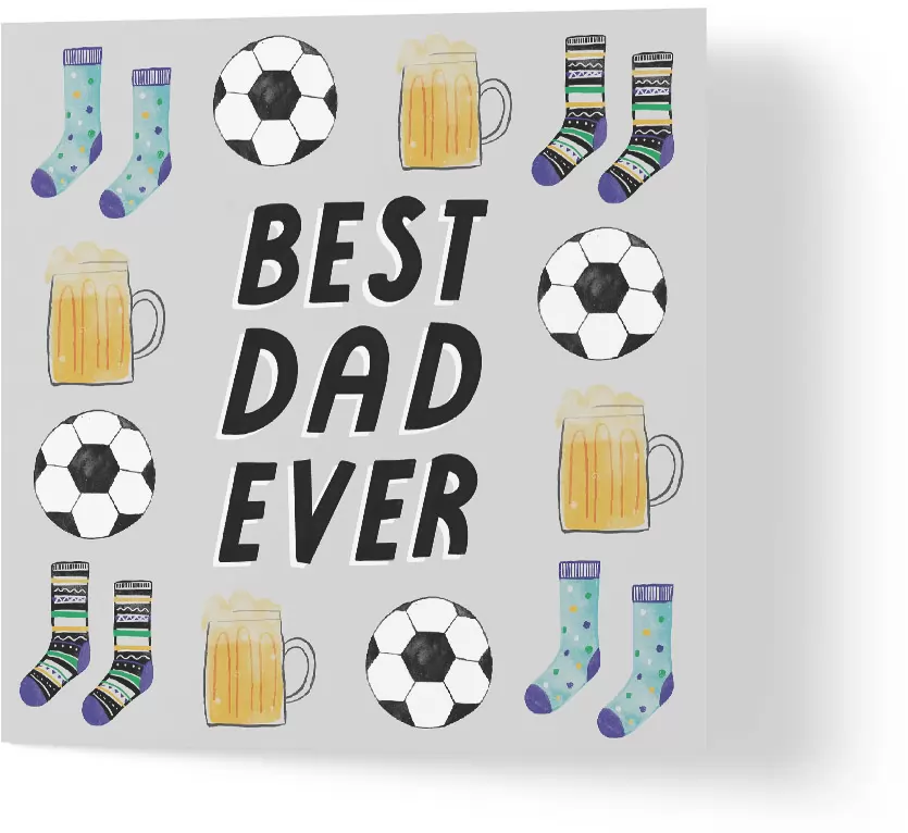
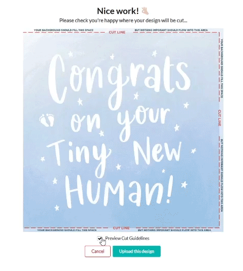
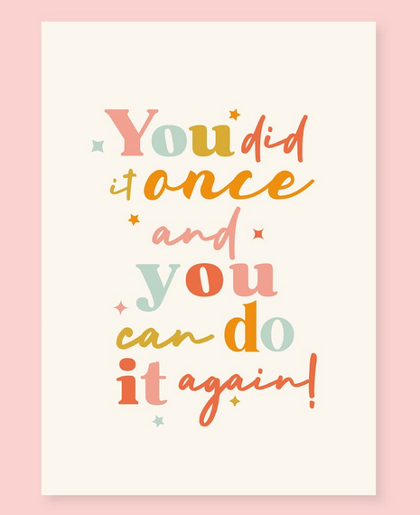
I am Beverley Hopwood, or Bev. Also known as beverleyhopwoodillustration. I’m a freelance illustrator and designer and have been very lucky to have been able to sustain this throughout my working career. I illustrate for various markets including homeware, gift, greeting cards and fashion. I love pattern, colour, typography and I love drawing characters. I don’t like to pin myself down to a particular style which allows me to work for such diverse clients. I find myself swapping from watercolour botanical drawings, to fun slogans, to cats in diving suits! (one of which is a card I designed for Wuzci!) Check out this card here.


What medium do you like to work with the most? Has this changed since you began your creative journey?


I tend to mix it up from hand-drawn or painted, to digital. It totally depends on the brief and how I want the end product to look. I will either draw directly onto the Mac or hand draw or paint in a sketchbook, then scan it in and manipulate it. I also use both Photoshop and Illustrator, again depending on the end feel of the design. My medium has most definitely changed from my early days at Uni to the present. Seen as there was only one computer in the whole course department; paint, paper and pens were the only option! Which in hindsight, I think it allowed far more room for creativity and mistakes, the latter being crucial! As computers became more accessible, in one of my first in-house design positions, I was given the opportunity to learn to draw digitally which, as a result, enables me to now have multiple choices to create.


What or who inspires your work? Do you ever suffer with creative block?


A cliché, but there’s inspiration everywhere! I am very visual and take in details all the time which affect my work. In a digital age, galleries, other artists work, what’s in stores, are all so accessible, especially during the past covid year, so Pinterest, blogs and creative art sites are all regularly visited for inspiration. Creative blocks of course happen but when you are working to continuous tight deadlines, there’s not much room for swanning off to a gallery for the day! 5 minutes away from my desk to grab a coffee normally sorts it! I find that just stepping away for even a short space of time allows your brain creatively to problem-solve.


Do you think greetings cards are important in the world today?


Most definitely!…..but as a greeting card designer, I would say that! Personally though, a handwritten or personalised card or letter means so much to me so I can only assume other people feel the same. Because we are all so entwined in digital worlds, in home and work life, receiving something physical that you can hold in your hands or place on a mantel holds far more weight to me than an email or text.

If there was one piece of advice you could give to a creator at the beginning of their journey, what would it be?


Sit up, sit straight and get a good chair! Ha ha! Apologies that it’s not creative advice but most of your working lives – especially in the creative sector, you will spend the rest of your life sat down and almost everyone I know in creative jobs suffer from some sort of back or neck problems, so take heed!
In relation to the actual career though, to survive as a freelancer you have to be willing to multi-task. You are the creative team first and foremost, but alongside that, the media manager, the accountant, photographer, admin, HR, editor and general dogs body!

Finally, do you have any exciting projects in the works that you’d like to talk about or anything that you’d like to plug?

I am very lucky to regularly work on such a lovely mix of end products, from greeting cards and childrenswear to homeware. Because they all launch at different times, in different stores and different continents throughout the year, it can be very hard to keep up with launch dates to plug anything!
In regards to new clients, I am working on some lovely children’s book concepts with one client and a new games project with another which are both new areas to me and very exciting. I’ll try and keep you posted on how it goes! Otherwise my instagram account @beverleyhopwoodillustration shows more day to day work and my website: beverleyhopwoodillustration.com showcases my portfolio.

Thank you Beverley for giving us such a great insight into what your creative journey looks like!

If you’d like to see more of Beverley’s card designs, check out her profile and socials via the button below.

View Designs

Want to read more Artist Spotlight posts?

Artist Spotlight: Diana Birkett

You might already be familiar with our Artist Spotlight series, but just in case you’re new here, this is where we feature one of our amazing artists and talk to them a little bit about their work. So grab a brew and sit down for a catch up 🙂

Who are you and what do you do?

I am Diana Birkett, artist, designer and illustrator

What medium do you like to work with the most? Has this changed since you began your creative journey?

I love to work with gouache as its so versatile, but my current favourite medium is oil paint on canvas. This has changed a few times over the years and digital artwork has become a big part of what I do but I still love using a paintbrush, this has remained a constant throughout.

What or who inspires your work? Do you ever suffer with creative block?

Nature is my biggest inspiration, and when I get creative block I tend to go out for a walk, and being lucky enough to live in the countryside this generally helps!

Do you think greetings cards are important in the world today?

I do think greetings cards are important to show loved ones and friends that you care and are thinking about them.

If there was one piece of advice you could give to a creator at the beginning of their journey, what would it be?

Persevere! Its so important to love what you do.

Finally, do you have any exciting projects in the works that you’d like to talk about or anything that you’d like to plug?

Hoping to take part in the Knutsford Art Trail on 10th and 11th July in a pop up display.

Thank you Diana for answering our questions!

If you’d like to see more of Diana’s card designs, check out her profile and socials via the button below.

View Designs

Want to read more Artist Spotlight posts?

Choosing The Perfect Father’s Day Card

It’s that time of year again! Father’s Day 2021 falls on Sunday 20th June, and now it’s time to select your cards! For Dads all over the country, whether they’re Grandads, Step-Dads, Dog Dads, or Dad-joke-dads, it’s the perfect opportunity to show them how much you appreciate all that they do.

If you’re stuck for ideas, why not check out our top picks to help you find the perfect card?

For the Football Dads…

For the Super Dads…

And the car loving Dads…

And the Grandads…

The Dads with hobbies…

and the Dads who like to cuddle…

…we’ve got a card for everyone!

So why not take a look at our full range? Not only will Dad be pleased you remembered to get a card, but you also supported a small business and an independent artist!

View Father’s Day Cards


Working in CMYK

Setting up artworks for print can be a pretty daunting task if it’s not something you’re used to. Ensuring your artwork is set to the correct colour profile is crucial if you want to match the print colours as closely as possible to what you see on screen. Of course there are still many variables to consider, even when working in CMYK – differences in screens, inks, paper stocks, texture and print presses. However by working with the correct colour profile, you eliminate any variables you are able to control and differences you see on the final print should be minor.

So what does CMYK mean?

CMYK refers to the inks used in printing; Cyan, Magenta, Yellow and Black. Any artwork that will be printed, needs to be supplied in the CMYK colour format to tell the printer how to create the correct colours. Most digital editing programs will have an option to alter your Colour Mode.

During printing, each of the four colours are layered to create the finished result.

These four inks are the reason we cannot accept artworks in RGB colour format. RGB (Red, Green, Blue) is what each pixel on your screen is made up of to create the on-screen colour you see. The breadth of colours available for RGB format is much bigger and is only used for electronic prints (TV, monitors, cameras etc).

So remember:

• RGB for screen

• CMYK for print

How do I set my document up to be CMYK?

If you’ve already started your artwork and aren’t sure whether you have set the document up correctly, you can usually check and adjust this at any point.

In Adobe Photoshop, simply hitting the keys CTRL + Y (Windows) or CMD + Y (Mac) will toggle a CMYK preview. This does not change the colour mode of the document, but you will be able to check any differences in colours.

Another great way to double check your colours in Adobe Photoshop can be found in the Colour Picker window. If the colour selected is not within the CMYK colour range, a small ! in a triangle will appear next to it. By clicking directly onto the symbol, the program will automatically select a colour in the CMYK range.

It’s as simple as that!

When designing your cards, to make sure the colours you see on screen match the final printed product, always make sure to work in the CMYK colour mode. But don’t worry – if you use our pre-made templates, you will see that these are already set up this way.

If you have any questions about artwork setup, feel free to drop us an email at hello@wuzci.com

Happy designing!

Working with Bleed

Figuring out if your artwork has enough bleed can be tricky – especially as different printers require different set ups. Some may require the bleed area to be outside of the canvas, whilst others, such as ourselves, require the bleed area to be within the canvas area.

So what is Bleed?

Bleed is ink that prints outside of the trim edge of the paper. This is to ensure that colour extends all the way to the edge once it has been trimmed. A minimum of 3mm bleed is needed for most print jobs because there is a degree of movement on any sort of press (Nothing is perfect, right?). Supplying artwork without sufficient bleed area can cause a white border around the edge of a print or important text to be cut off.

Making sure your cards have a bleed area

To ensure your card designs have adequate bleed area, the canvas must be set up to 15.3×15.6cm. This will create an extra 3mm on the top, bottom and right edges of the design. Once the cards are trimmed, they measure 15x15cm.

The below image illustrates the top, bottom and right 3mm border your artwork requires. Background colours or patterns should still fill this space, so that there aren’t any white lines after trimming. However, it is crucial that there is no text in this area.

In the artist Welcome Pack, you will be supplied with a template to ensure you are using the correct dimensions for your designs. Our web Uploader also has a handy Bleed Guideline you can toggle on or off to ensure none of the important bits will be cut off after trimming.

Remember: centered designs will be 3mm to the left because of the bleed on the right hand side.

And that’s it!

It’s very straightforward when you know what your printer requires. If you’re still struggling, feel free to shoot us an email at hello@wuzci.com

Happy designing!

Creating the Perfect Card

Here at Wuzci, we want to help your design skills thrive and offer every opportunity to improve (and thus, increase your sales!). Sometimes this can mean a simple font tweak or adjusting your design layout so that it reads more easily.

With our brand new Artist Uploader, more of the power is in your hands. You are in charge of ensuring your designs look top notch on the shop, from the image to the name and the description. Ensuring your product listings look clean and professional is the surest way to capture your audience and pull in more of your commission.

We have pulled together some of our top tips & tricks to help your designs shine on our shop.

1. Starting the Design

Having a very clear image of the audience for a card is of the most important starting point. As you’re putting pencil to paper, ask yourself: Who is going to buy this card? Who are they buying it for? What kind of voice am I trying to convey with this design? Do I want to make people laugh, or am I helping them convey something much deeper?

Once you have a clear vision of who and why this card would be sent, using contemporary inspiration for fonts and colours can help bring your idea to life. Why not check out our inspiration boards on Pinterest or one of our Inspiration Emails?

TIP: Using a variety of fonts within your collection of designs could help you to cater to a wider audience and make sure your cards don’t all have the same ‘feel’
TIP: Instead of leaving the text central in this design, pushing it to the left gives it a more interesting composition and stops the darker blue from dominating too much of the frame.

2. Uploading your designs

Once your design is finished up, it’s time to upload it onto the shop!
All designs must measure 15.3cm x 15.6cm to allow for a 3mm bleed along the top, bottom and right edges. Check out our guide on Bleed.

After dropping your design into our Uploader tool, you will be able to preview it with or without the bleed guidelines. Designs need to be centralised within the 15cm square, not the entire canvas as this will result in designs either being cut off or looking off-center once printed.

TIP: If your design contains a border like this one from Quince Prints, ensure it is correctly centralised after the edges have been trimmed. Designs that do not meet this criteria will be rejected.

3. Naming and Descriptions

Creating your design name and description is the last, but one of the most important steps in submitting a design.


• Design titles need to be short and relevant. Using the phrase on the card or something related to the category is a good place to start. You do not need to write “Card” in the title.

• The description is what customers will see on the product page. This can describe the card in more detail than the title, but could also be a good place to write in who the card could be for or the perfect time to give it to someone.

• Adding relevant tags is the best way for customers to reach your design. Think about the search terms someone might use to get to your card. Put yourself in the customer’s shoes, keep it simple and remember to use words that describe your card well, e.g. “Dachshund card”, “Funny card”, or “Girly”.

• Remember that search engines also pull information from the product pages. The more accurately you describe your card, the higher chance it has of appearing in a potential customer’s search result.

E.g. When searching for “Dog Card”, Google pulls these results and puts those key words in bold.
TIP: It can be tempting to get lazy at this point, but customers won’t be able to find your cards if they aren’t tagged properly! Everything written on the product page helps to boost the designs SEO!

4. Waiting for Approval

Once your design is submitted, you will see the below message.
Designs are usually reviewed within 24 hours of submission and you will receive an email notification once it’s gone live. Please be patient whilst your design is under consideration.

If there are any problems with your submission, we will contact you outlining what we need you to amend and requesting that you re-submit once those changes have been made.

If you’re unsure about any part of this process, simply drop us an email at hello@wuzci.com


Happy designing!

Writing a Thoughtful Sympathy Card

Writing a sympathy card is a task that nobody wants to have to do. It’s not an enjoyable occasion and often something that we can’t plan for. But, it is an important gesture to show our support during a difficult time. It can also be a practical way to offer some much needed help.

Nobody wants to risk writing the wrong thing, so here are some tips help you relax and write a thoughtful message that shows you care.

After picking out the perfect card, these phrases can be a good place to start:

  • “We are so sorry for your loss”
  • “With deepest sympathy, as you remember ______”
  • “My thoughts are with you and your family during this difficult time”
  • “Thinking of you and wishing you moments of peace and comfort as you remember a loved one”
  • “I’m deeply sorry your family is experiencing the pain of a loss like this. My heart goes out to each of you.”
  • “It’s going to take time to get through the shock of this loss. Just want you to know we’ll be here for you all the way.”
  • “We were surprised and saddened to hear of _______ passing. We will miss them very much”

If you are writing to friends or family members of the deceased who may not know you, it might be thoughtful to mention how you knew their loved one. Sharing a little anecdote can help grieving family members or friends feel closer to those no longer with them. It can also be comforting to hear that others thought highly of their loved one, so be sure to let your recipients know.

  • “I feel so lucky to have known them. They lived an extraordinary life and I will never forget the time we ______”
  • “_____ touched so many lives for the good. I am grateful to have had such a wonderful colleague and friend. We will all miss her very much.”
  • “The funeral service was a great tribute to him and all that he has done for our community. ______ was a kind and generous man who will be missed greatly.”

If you’re in a position to help out your recipient in any way, be sure to let them know. People often don’t reach out when they are grieving because they don’t want to feel like a burden to their friends or family members. Offering something specific, such as taking over food or mowing their lawn, can be a great help during somebody’s grieving process and a good segue to check in on them.

  • “Thinking of you and your family. I’d like to help in any way I can. I’ll call later this week to see when would be a good time to bring over a meal for you.”
  • “I know that _______ used to take care of mowing the lawn. I’d love to come and help out with that.”
  • “You have so much on your mind right now, so let me give you one less thing to worry about and take care of ________”

The important thing about offering help is to follow through with it. After you’ve sent your card, give them a phone call after a couple of days to make plans.

So whether the card says it all for you, or you’ve written an extra message inside, sending a Sympathy card is an important, thoughtful touch that can help a person feel less alone during their grief.

Browse Sympathy Cards

If you don’t have time to write out your card by hand and post it, consider trying out our “Direct to recipient” feature.

Our unique fonts adapt to look like real handwriting and give your messages the perfect personal touch.

Writing the Perfect Message in Birthday Cards

You started out well. You’ve set your occasion reminders, chosen the perfect card and it’s been delivered to your door. But now you don’t know how to craft the perfect message!

Don’t worry! Wuzci have got you covered for this.

Writing a card shouldn’t have to be such a chore. Instead of writing the standard, “Happy Birthday!”, there are so many ways to make a card feel more personal and it’s a great way to share something unique to your relationship.

The perfect card doesn’t leave much unsaid on the front, but if you’re wanting to add some warmth to your inside message, you could try any of the following phrases:

  • “Warmest wishes for a happy birthday”
  • “Hope your [25th] birthday is a day to remember!”
  • “Hope all your birthday wishes and dreams come true. Happy Birthday!”
  • “Another birthday, another year filled with fun and adventure”

But what if those aren’t your style? Try adding a dash of humour instead:

  • “Happy Birthday! May your Facebook wall be filled with messages from people you never talk to”
  • “Happy Birthday to one of the few people whose birthday I can actually remember”
  • “You’re only young once, but you can be immature for a lifetime. Happy Birthday!”

Some of the best cards are the ones that contain something really personal. Including a special message about birthday plans you might have together, an inside joke or even a funny nickname, can make all the difference on someone’s big day. Those are the kind of cards that people save and come back to read years later… because what’s better than feeling like somebody really gets you?

No matter what you end up writing in your card, the most important part of a loved one’s birthday is showing them that you care. Wuzci has everything you need to make their day extra special, with over 3000 designs to choose from and almost 200 independent artists, the perfect card is just waiting to be found.

So what are you waiting for? Check out our fabulous range of birthday cards and get crafting the perfect message! Shop now.

2021 Lockdown Delays at Royal Mail

Hi Gang,

Unfortunately due to Covid-19, Royal Mail are now experiencing some severe delivery delays. We are working around the clock to ensure your orders are dispatched with plenty of time, but please bear in mind that once we have posted your card orders, this is out of our hands.

According to news, these regions are experiencing the worst delays currently:

  • Ashford (TN23-TN27)
  • Barnsley (S70, S71, S72 and S75)
  • Basildon (SS13-SS16)
  • Bow (E3)
  • Bury St Edmunds (IP28-IP33)
  • Chelmsford (CM1-CM3)
  • Christchurch (BH23)
  • Daventry (NN11)
  • Debden (IG7-IG10)
  • Enfield (EN1-EN3)
  • Grays (RM16-RM20)
  • Hampton (TW12)
  • Highbury (N5)
  • Hornsey (N8)
  • Horsham (RH12, RH13)
  • Ilford (IG1-IG6)
  • Leeds City (LS1-LS5)
  • Lewisham (SE13)
  • Magherafelt (BT45, BT46)
  • Margate (CT7-CT9)
  • Rugeley (WS15)
  • Somerton (TA11)
  • South Ockendon (RM15)
  • South Woodford (E18)
  • Upper Holloway (N7)
  • Wandsworth (SW18)
  • Wellington (TA21)
  • Widnes (WA8)

We really appreciate your support. Please stay safe and stay home!

Thanks,

The Wuzci Team.

Artist Spotlight: Amy Cole

You might have already seen out Artist Spotlight series, where we interview artists from our amazing community and see what inspires them and how they create their designs. Our last interview was with Jessica Gutteridge, which you can catch up on here. Today we’re interviewing Amy Cole, so grab a cuppa and sit down for a catch up!

Who are you and What do you do?

My name is Amy Cole also known as Amycoledesign. I am a freelance illustrator and pattern maker. I love drawing and creating  cute animals and pretty patterns is usually what you will find me designing. Colours are also a big part of my work as I love putting together new colour schemes for my designs.   

Where did your creative journey start?

From a very young age I loved to draw and make cards with my mum at the kitchen table.. It started with me taking every possible art subject in my GCSE’s to then going on to study Fine Art at The Northern School of Art where I strengthened my drawing skills. I then moved to Leeds where I studied Printed Textiles and Surface Pattern Design at Leeds Art University where I had the time of my life, I loved my course as it made me understand the background of becoming a designer and lead me on the right path for my design future.


Do you think greetings cards are important in the world today? 

100%! I think it is especially important now more than ever as the world is so digital. I think receiving a card through the post is so exciting and feels very special that someone saw a design on a card and thought of you and hold space for personal words inside. I love the personal touch greeting cards give and to see someones hand writing rather than a text message.


What inspires you to keep creating? How do you get past drawing block or boredom with your work?

Every designer has hit a creative block in there life and I find them tricky to get out of from time to time. When I hot a block I like to step away from my work for a bit and then go back to it with fresh eyes. I also find looking on Pinterest and Instagram always helps as i love seeing other peoples works and helps me get inspired for my own work.


Who are your favourite artists/creators at the moment?

This is a tough one, I love so many creators it would be to hard to choose.


Can you tell us a little bit about your process? How do you create your work?

I used to always draw by hand on paper but since getting my Ipad Pro I love drawing on that with my Apple pencil using Procreate. I love how you can use a number of textured brushes and have full control. To make my patterns and to make repeats I use Illustrator which I love and makes everything so easy.


If there was one piece of advice you could give to a creator at the beginning of their journey, what would it be?

To not compare yourself to other designers and with your work looked like theirs or wish you could draw like they do because all designers are unique and have their own way of working, when i started to focus on myself and how I work is when I finally got the confidence I needed to design. Also make sure to not give up, I had a few moments at the start when I wasn’t sure if I could do it or make a living from design but I loved it and didn’t want to stop and I am so glad I kept with it.


Finally, do you have any projects in the works or exciting things you would like to plug?

I am currently working on revamping my Etsy shop full of exciting new products and prints, it is a big job and I am getting there finally! My Etsy shop is AmyColestudio so keep your eyes peeled for new fun prints and products over there!

View Amy’s Designs